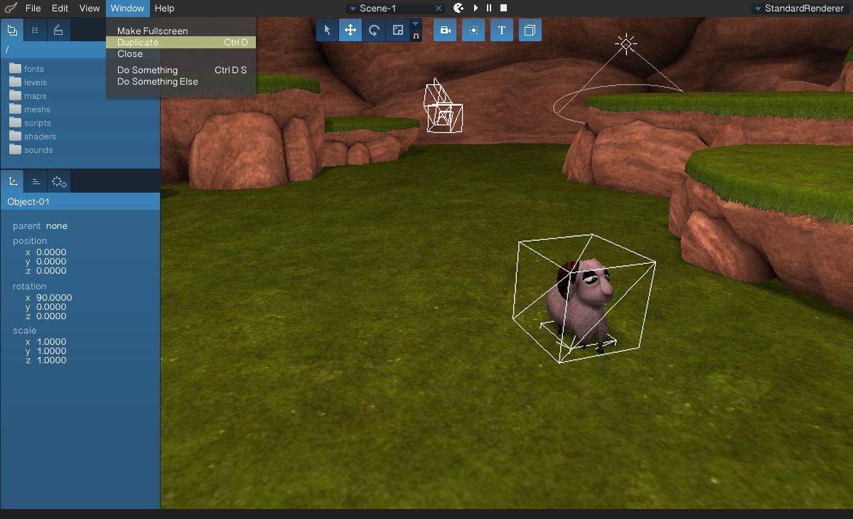
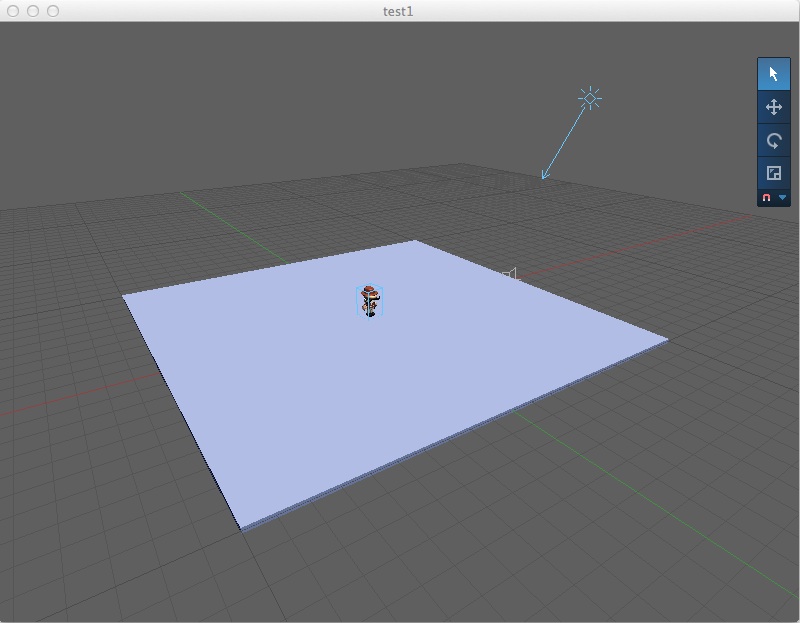
Topic: UI Mockup

Hi all,

as I currently need to rewrite a lot of code on Maratis-Editor side, because of MGui2,
I taught it might be better to do a UI cleanup at the same time.

So I faked a possible new UI on photoshop, with suggestions from Vegas mockup and community in general :

http://anael.maratis3d.com/croquis/ui_mockup01.jpg

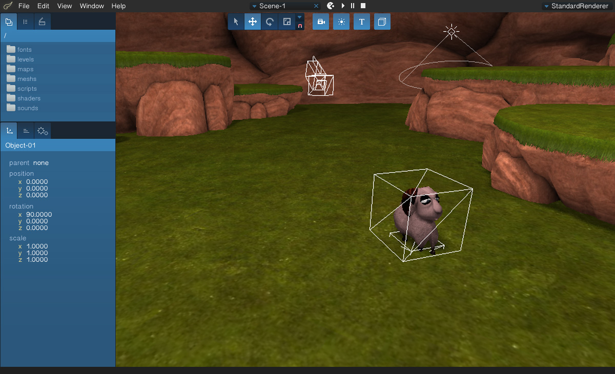
I'm also reorganizing the editor code itself to be more modular and to allow multiple windows
(copy of the main window or custom plugin window)

I removed the timeline on this screenshot, to replace it with a console that would come up when an error is detected.
But I'm still not sure if a timeline is still needed or not, or if a play/pause button is enough to preview the animations.

What do you think of the modifications ? do you prefer the old UI ?

Re: UI Mockup

Your mockup looks really good, looks like a nice improvement.

Re: UI Mockup

anael wrote:

do you prefer the old UI ?

No way ! That new feel is awesome, pretty sleek design. I like it alot wink

anael wrote:

I removed the timeline on this screenshot, to replace it with a console that would come up when an error is detected.

I won't miss the old timeline personally, i always thought it was taking alot of space unnecessarily - but about that new console, is it meant to fully replace the floating console window (sooner or later) ?

Re: UI Mockup

it's really awesome , the console  is a very good idea
does it means that some users could work on code proposals for interfaces in the future ? some users would love that

Last edited by ulbex (2014-05-27 10:54:58)

Re: UI Mockup

I'm happy you like it.

about that new console, is it meant to fully replace the floating console window (sooner or later) ?

This floating window was only there on windows, so in a way yes, but because the new editor will support multiple windows, we could add the option to extract the console from the main UI. The main idea is to give immediate feedback when an error message is detected. For example, when you start the game, if an error is detected in the script, the console will come up to show you the error.

does it means that some users could work on code proposals for interfaces in the future ?

I will be easier to add functionalities after the code cleaning, and it will be possible to add custom windows/buttons to the editor with plugins.

Re: UI Mockup

Update :

http://anael.maratis3d.com/croquis/ui_mockup02.jpg

Re: UI Mockup

Another idea would be to replace the camera, light and text buttons by a "Add" Menu
and move the transformation buttons to the right, to gain more space :

http://anael.maratis3d.com/croquis/ui_mockup03.jpg

It is also less busy near the scene menu.
What do you think ?

Re: UI Mockup

I prefer the add light/camera/text in a subemenu yes, for the floating bar, both are fine to me,
i tend to prefer horizontal menu when there's alot of options, but for less than 20 items, vertical is good too

oh and i didnt know there wasn't a console window on other OS, that's good, to me the console always gets in the way, would be nicer if it was integrated somehow

Re: UI Mockup

I am liking the new look and layout. My main issue was having to navigate through the file system for assets. If I can get to them quicker, that is much better.

And is that snapping I see?! (post 6) hehe.

Re: UI Mockup

The GUI pimp is a great idea. I would use different tones of grey instead of blue in the interface, so it wouldn't make conflict with in-game colors. I also would unify all buttons in the top row to gain more space.

Re: UI Mockup

psikoT :
- Blue is really the identity of the editor, and every 3d softwares now looks similar. I made some experiment and blue is actually very zen and neutral, it also give a good contrast with text. But everything will be themable and not hard coded like the current UI, so it will be very easy to customize the colors.

- the top row buttons, do you mean the pacman, play, pause and stop buttons ?
It's true the size is not coherent and it could be smaller.

Re: UI Mockup

anael wrote:

- the top row buttons, do you mean the pacman, play, pause and stop buttons ?
It's true the size is not coherent and it could be smaller.

I meant to put all buttons (transform tools) in the same row as the pacman, play, etc, maybe with a separation between categories.

About the blue as neutral, well... it's not so neutral as grey. big_smile  But since it's planned to be customizable, it's ok. Anyway, you can use the blue as highlights (buttons, hover-active states, etc) so you never loose your identity.

Re: UI Mockup

For info, here is the same UI in grey :
http://anael.maratis3d.com/croquis/ui_mockup_grey.jpg

And here is Unity :
http://tinmangames.com.au/blog/wp-content/uploads/GA1InUnity1200.png

3dsMax :
http://i0.wp.com/www.cgmeetup.net/home/wp-content/uploads/2013/08/3ds-Max-to-Unity-3d-3.jpg?resize=854%2C469

And Blender :
http://i0.wp.com/www.cgmeetup.net/home/wp-content/uploads/2013/11/UV-Unwrapping-and-Texture-Painting-in-Blender-Tutorial-1.jpg?resize=960%2C540

Re: UI Mockup

I like the blue myself.  Still looks pretty slick in grey though.

Re: UI Mockup

I love it in grey!  big_smile 

Glad you post also 3 top-notch examples of a well designed interface. As you can see, serious software don't have in consideration the color of the UI as a key element of the identity. They think on ergonomie as main priority. The fact that they have the same UI color doesn't make them less 'unique'.

As side note: I was working on a game for long time, the game has some special tones of green and I personally would hate to work on it with a huge blue block in the left side. Anyway, since UI customization is planned to be possible, those details are not so important, just wanted to give my honest opinion.

Re: UI Mockup

Another variant :

http://anael.maratis3d.com/croquis/ui_mockup04.jpg

Re: UI Mockup

anael wrote:

Another variant :

looks great!
Are there any functional changes? Martis a great engine, but to become popular it lacks the simple things (Navmesh, water, insufficient LUA API) .

Re: UI Mockup

Looks great!... I would give more contrast to the selected submenu item though. Maybe you can try with a darker grey instead the green. I think you should avoid to use more than one color for highlights, it will make the layout more compact.

Apart from that, I would add very subtle dividers in the properties box (bottom left) to separate tools in different groups, but that's a personal choice.

Keep the good job, love that minimal UI.

Re: UI Mockup

Will you be updating the Mac version of Maratis to allow .mproj files to open with Maratis? I still can't figure that out.

Re: UI Mockup

Update about the implementation:

The new editor using MGui2 is on progress inside the experimental branch, I had to clean and recode all the editor part, and now the base is working, with a flexible (and extendable) design.

I also corrected some of the engine code and implemented missing features. The editor selection code was reworked using a better raytracing system, it's faster and allows to select objects from front to back (objects inside other objects could not be selected easily).

I added directional lights in the renderer and the editor view, and started implementing the new GUI with a theme/preference system :

http://maratis3d.org/images/wip/mgui2_editor01.jpg

There is still a lot of work, and it's hard for me to find free time because of my professional activity, but it's moving !